Two TVs Interior Designers Will Actually Like
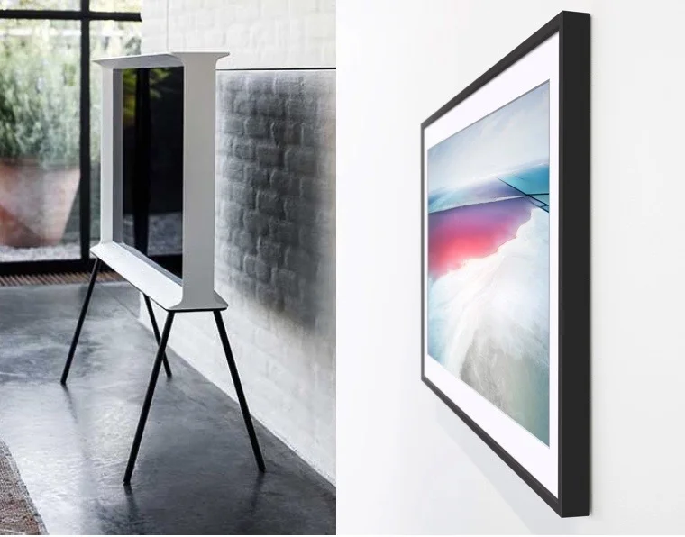
These are televisions. Can I get an Amen? Can I get a Praise Be? All glory and thanks to Samsung electronics for figuring out that a TV is an integral part of our homes, and our homes deserve better than the black hole of death that most TVs are. In the realm of interior design there are two TV camps: The Displayers and The Hiders (OK there may be a third camp, The Banishers, but this story is not for them). Back to the TVs. These new releases from Samsung ensure The Displayers get a TV and The Hiders get a TV. On the left we have the Serif (for The Displayers) and on the right, Frame (for The Hiders). First let's meet Serif.
Serif
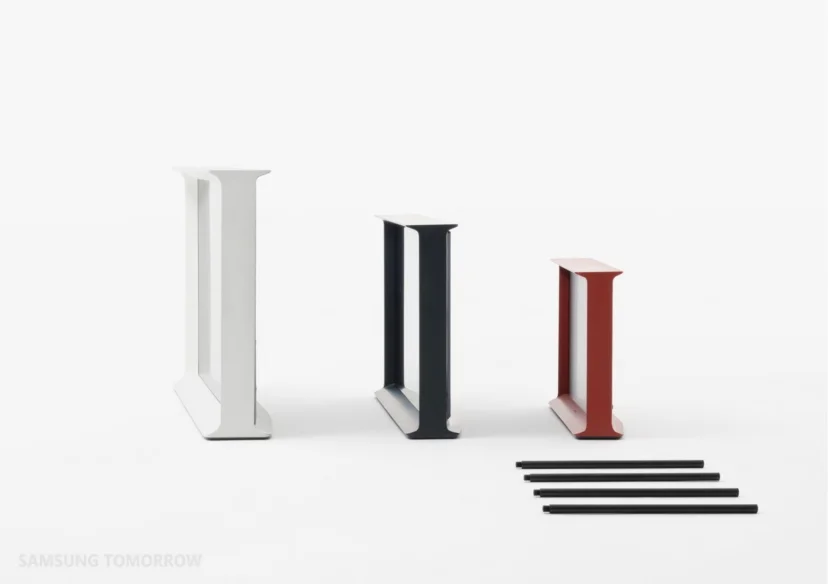
Serif was designed by Ronan and Erwan Bouroullec. The idea behind the design was to create an object that has a place in the room. Don't try to hide it. Make it a designed item with its own merit. Inspiration for form and name came from an upper case letter I as it would appear in a serif font.
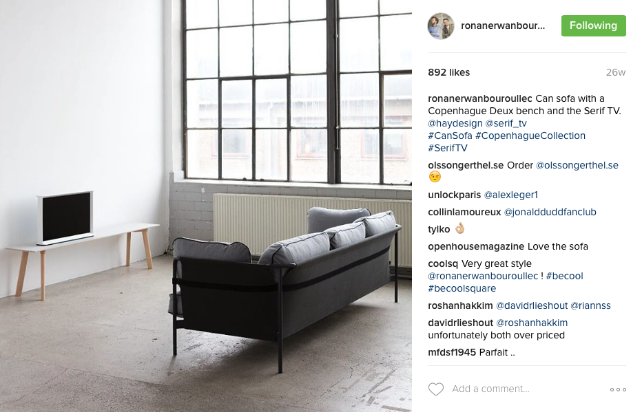
The Serif launched in Europe last year and it caught my eye on Instagram because an account I follow (cannot remember which one) posted an image or two from this product placement collaboration above. There is Serif sitting pretty in the most glorious Antwerp interior. I instantly recognized the Graanmarkt 13 apartment designed by Vincent Van Duysen. I had just returned from Antwerp at the time and had visited the shop below the apt (but only gazed longingly at the staircase rising to this apartment). Here's a beautiful video below on the Samsung collab with Cereal mag and Graanmarkt 13:
After catching these first glimpses I had to learn more so I did some poking around with hashtags and found a few posts by the designers themselves.
The Serif really is a lovely object just on its own.
I was happy to learn the Serif also comes in smaller sizes. Because even those on team The Displayers have a sense of what the scale of such an item should be in a room. Except it seems we in Canada only have access to the 40-inch model. Insert sad trombone sound.
Serif launched in Canada at the Interior Design Show in January. I gotta be honest, I was a little puzzled by the Canadian launch. Maybe I was too hyped by the Bouroullec/Van Duysen spin. Also, Samsung had a lot of other product launching at IDS. Anyhoo, The Serif models were tucked away on a upstairs part of the booth with zero visibility to people walking by and limited capacity for those willing to ascend the stairs.
This is the furniture in the room setting to accompany the Serif. The TVs are on the right side of this — I couldn't get far enough back to get them in with the furniture. Um, Dear Team Samsung and Team North Strategic PR, call me the next time you need to style a product launch. Seriously.
The Frame
Last week was the Toronto launch of The Frame TV. Again, I had already seen the European launch play out at the Louvre on my Instagram feed. That's The Frame in the centre of the art wall in this Samsung press image above. The design idea is genius. And obvious, like all the best ideas — Post-it notes, Liquid Paper etc. The kind of idea that, once it comes into being, you think yes, of course this makes the most sense. Why have we not done this until now? In this case probably advancements in technology have helped create a screen that can be framed, hung flush to the wall and be just a couple inches deep. Technology may have paved the way, but Yves Béhar, creator of The Frame, turned it into something beautiful.
In addition to thinness and flush mounting, the other great innovation of The Frame is that when it is turned off it is not just a dead black hole. Instead it displays art. If I had a dime for every time I was on a photo shoot trying to cue up the best looking black and white scene from whatever was on TCM (classic movies being the image of choice when a TV must be in a room shot), I'd at least be able to buy myself a Starbucks. The Frame TV comes pre-loaded with hundreds of artworks to choose from to display when the TV is not being watched. Samsung has commissioned art worldwide specifically for this feature.
The Toronto launch was held at Lumas art gallery and here's a shot above from the event. There's the TV on the lower left with a stunning image by BC travel and adventure photographer Callum Snape, who was commissioned by Samsung to contribute some of his work to The Frame art library. In addition to having probably the best name, Callum is a serious talent. Find him on Instagram here and marvel and what he sees through a camera lens. You will get goosebumps.
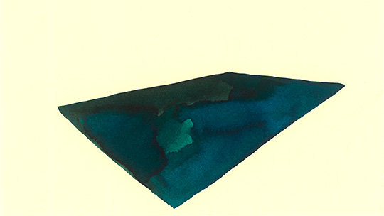
I browsed the available art section for The Frame and found a few favourites.
You can also display your own image or multiple images and choose from more than 10 digital matte colours and styles - or opt for no matte. The Frame ships with a black frame but additional clip-on frames in walnut, blond wood and white are available to purchase separately, as is a tripod stand (seen above). The Frame is available in Canada in two sizes, 55in and 65in. I wish with all my heart there was just one size down. Apparently they exist in other parts of the world. Le sigh. But if one had too, one would make room for the 55in model, or one would opt for the 40in Serif. Hmmmm.
Earlier I was speaking about event styling. For the most part last week's event was quite chic. The gallery itself and the art collection curated to go with the TVs was wonderful. But then there were a few pillows stuffed in baskets in the space (see above). Pillows in baskets — je ne comprends pas. ¯\_(ツ)_/¯
Serif, 4K TV, $2,199 (40in), Bay Bloor Radio
The Fame, 4k LED TV, $2,699 (55in) and $3,799 (65in),
Visit Samsung Canada for more info.


