Obsessed: Dark Green Kitchens
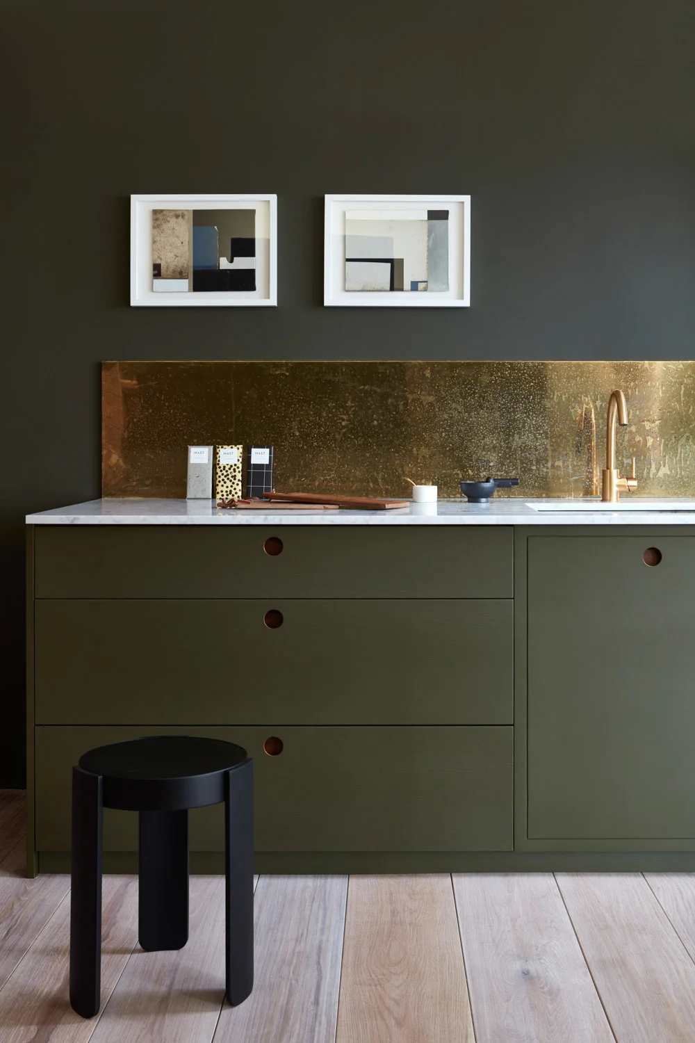
Ladbroke kitchen, Naked Kitchens
When I came across this photo recently in my digital travels I nearly fainted. I've been hoarding paint and fabric samples all with the common thread of this mucky green colour. I have no immediate plans or projects that suit this paint or these fabrics, but in the same way that if you find a great dress you should go ahead and buy it and the occasion will come, well, in that same way I'm hoping the project comes along. Things I love about this kitchen: everything. I mean, I could make a list, but it would be a list of literally everything you see. But for a moment let's enjoy specifically how the wall colour is the same colour as the cabinets.
This is the paint chip pulled from the Little Greene paint company web site. It's called Invisible Green and I'm sure it looks mostly black on your screen, as it does on mine. But maybe as soon a you put a little patinated brass next to it it greens right up — just like the kitchen. Little Greene is a UK paint company but they have stockists in Paris and you better believe that I'll be hitting one up when I'm in Paris next week. I'll be hoarding a bunch of paint chips. Yep, I'm that weirdo. (Did I ever tell you about the time I went to Germany to Manufactum and brought back string, and a pencil sharpener. And I had to declare it all to the customs guy because my luggage didn't make it onto my flight and was coming a day later. Customs agent: "Let me get this straight Ma'am, you spent about $100 and you bought string, a pencil sharpener and some tea towels?" Me: "Yes")
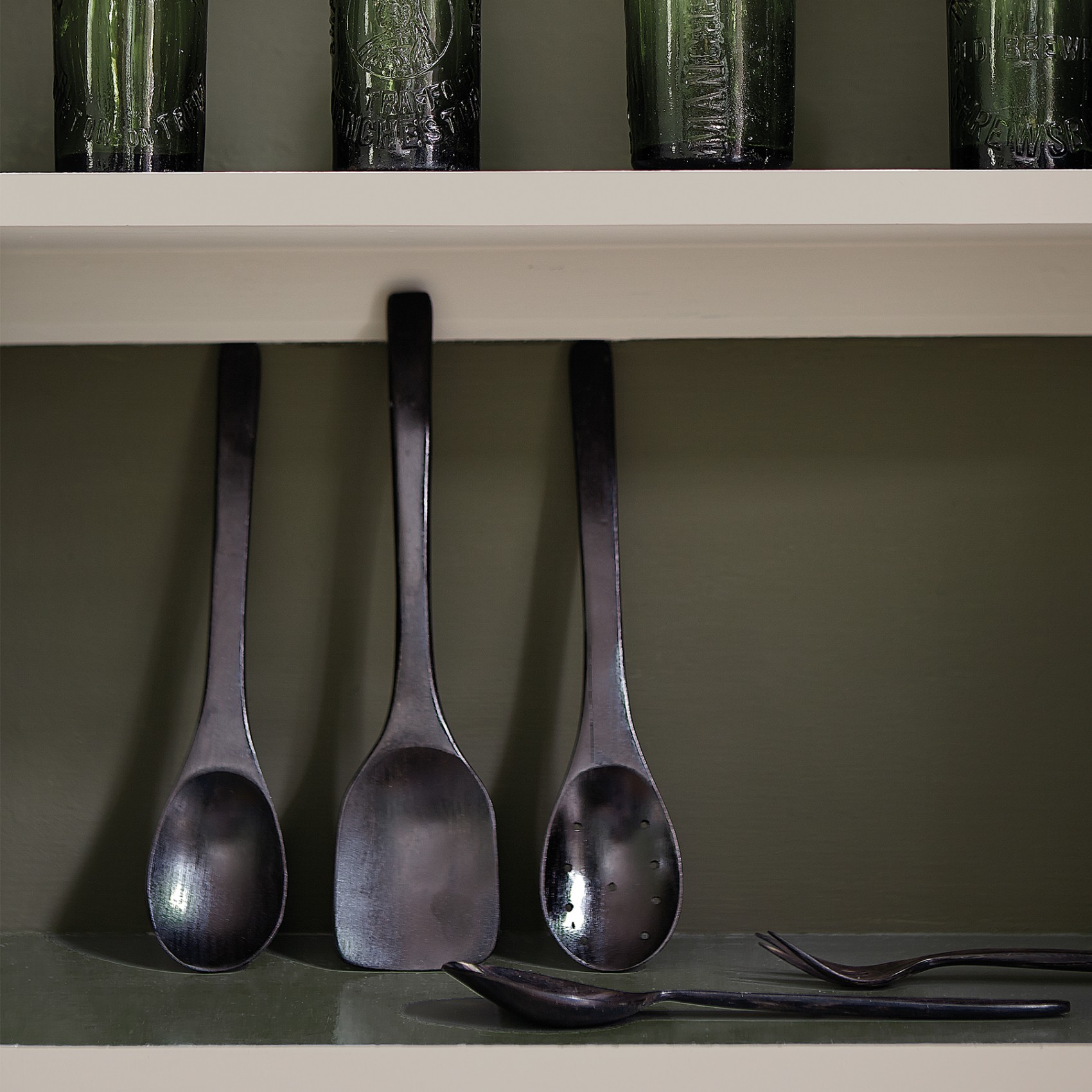
Ok, back to Invisible Green. These are a couple more examples if Invisible Green in situ. Mmmmmmmm.
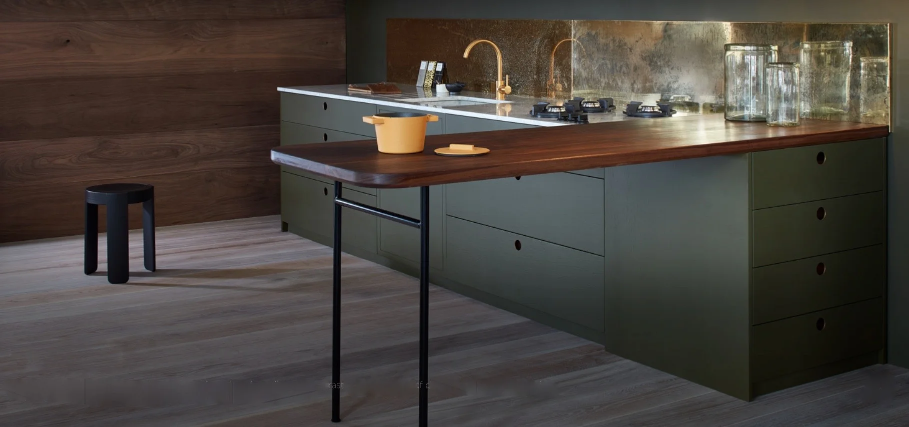
Ladbroke kitchen, Naked Kitchens
The kitchen of my dreams is just a showroom kitchen, as you can see by shot 2. But I still have plenty of love for it. Check out the play between the woods of the breakfast bar, floor and wall. Interesting.
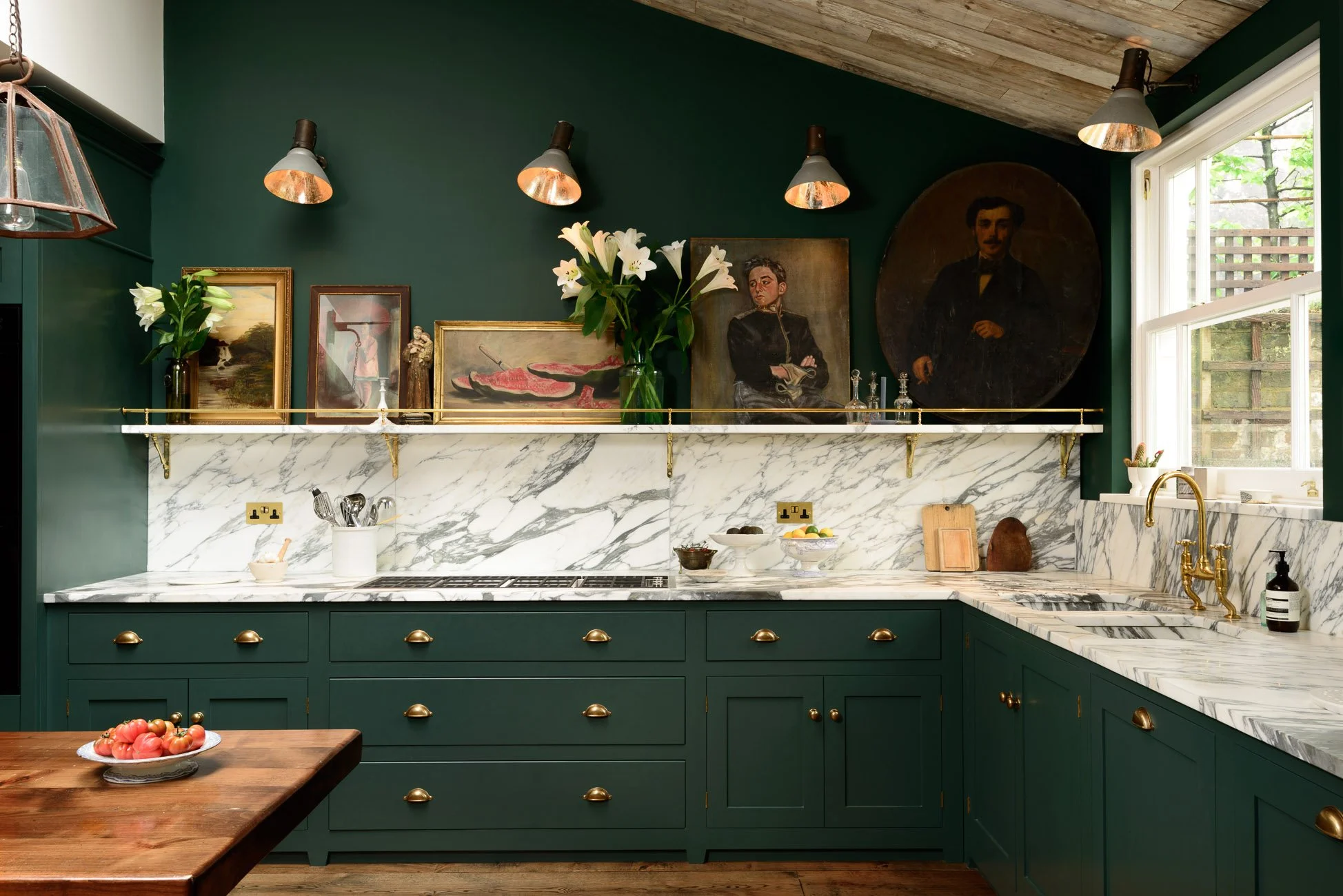
Here's another green kitchen of my dreams. This one's by deVol (of friggin' course!). Notice again walls and cabinets in the same colour. Also, hello amazing veined marble and killer artwork and brass gallery, and and and. Let's take another look...
The only thing I don't dig here are those lights. For me those are a no. Here's one more killer shot:
This super wide angle shows the whole shebang. Not the ceiling, the worn out sofa and the dish cabinet on the right.
kitchen, deVOL
This one is also deVOL. The colour is described as Flint, which to me is more of a dark grey, but I swear there's some green in this. And please also join me in appreciating that walls and open shelves are all painted the same colour.
kitchen, Plain English
I certainly can't have a kitchen design party without including Plain English. My design for our Tweed kitchen is inspired by the Plain English Shaker kitchen, but I must say with a little paint it might approach this territory.....hmmmm....here are some paint colours I'm thinking about...

