Behind the Scenes: HomeSense Ad Styling
I was scrolling through a story on the Interwebs the other day and something in the ad space to the right of the article caught my eye. It caught my eye because Hey, I did that! Here's a look at four of the shots (we did 21 in total) from the HomeSense ad campaign I styled in August and mentioned in my You'll Never Be Younger to Learn post. The concept for the campaign is the work of some great people at the Sid Lee agency and is centred around playing up the phrase "Styles may vary". This phrase appears with an asterisk on all HomeSense ads because you never know what you will find at a HomeSense store — and you may not even be able to find the items in the ads. The Sid Lee and HomeSense team was keen to put a positive spin on this sometimes-frustrating reality. Play up the Thrill of the Hunt angle.
For the series shown here the idea was to feature 4 hero products — canisters, carpet, tea set and cookware — to entice people into the stores. The creative brief was that I should style each of the items as they would appear in your home, but with minimal additional props.
For every shoot there's a meeting of all the people collaborating on the shoot to review how the items will be shot and what props will be included. In editorial we call it the preview. In advertising it's call the pre production meeting or "prepro" for short. At the prepro the day before the shoot I presented how I would style these for a kitchen. But the clients expressed a desire that they be for the living room. Oops! Sorry. After the prepro I hit up a local HomeSense to pull the artwork that's leaning in the background and the wood box plus the shelf the items are sitting on. As a stylist you always have to be ready to pivot your approach in an instant and with no fuss. Done and done.
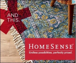
This was probably the simplest shot of the campaign. I brought the flooring to the studio and used it in several shots in the campaign. This side table brings in a touch of warm wood that I think really plays up the boho appeal of the carpet. I had a few pairs of shoes on hand as options for this shot, but each pair was taking too much attention away from the carpet. Keep it simple was the best plan (as it so often is).
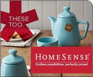
This pretty tea set reminded me of English cottage style so I went with it. I brought in a beadboard backdrop and a vintage wood surface to set the cottage mood. You can just barely see them behind the asterisk, but I found Walker's shortbread at HomeSense as the perfect food prop for this shot (and yes, after we shot them we ate them). I can now say that I styled a tea bag tag (slight tilt) — I love how it looks in this shot. (yes, detail freak)
These pots are fantastic! Love the wood handles. I must say I feel like the red graphics are impeding my appreciation of them in this particular instance. But whaddaya gonna do?I used the same beadboard backdrop as the previous shot but switched the surface to marble so that it would look like a kitchen counter — and bring a high end look. The tea towels just peeking in in the foreground on the left are so lovely with stripes and fringe. I wish you could see them a bit more. And the vessel in the back on the right is a rustic cream jug with utensils in it. We debated at the prepro whether there should be some food inside the pot. I think we were right in deciding against it. For a pot like this you would need it to be a soup or a stew of some sort and frankly, that's just not the prettiest food.
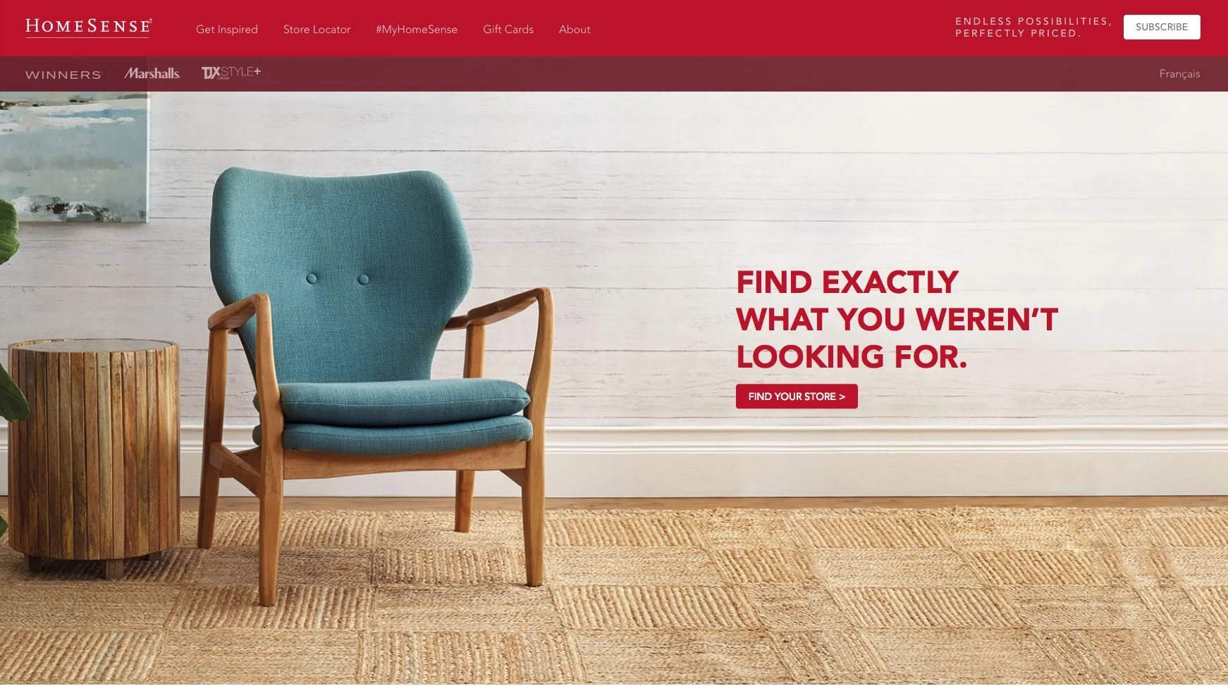
And lastly, here is another shot from the campaign. This one is currently running on the HomeSense web site home page. Love this chair. The colour of the wood and the teal upholstery were giving me an earthy modern vibe — California bungalow. So I played it up with faux bois wallpaper and a killer rush carpet that I totally want to buy from HomeSense! In the shot we took you saw more of the fiddle leaf fig (which I brought from home) and it's in a great looking basket that I actually did buy. I also desperately wanted to put something on the side table but alas...I must concede that the plant and something on the side table would take attention away from the chair. That tag line — Find exactly what you weren't looking for — is the clever work of the team at Sid Lee and really captures the essence of the HomeSense shopping experience. Fun project to work on!
all the photos for this campaign are by Donna Griffith.

