Morgan & Mees Hotel, Amsterdam
It's the one that got away. I was searching my heart out for stylish places to stay during our upcoming autumnal European adventure, when I found this gem in Amsterdam. Perfect! The Morgan & Mees is historic, yet modern; decorated just enough, but not too much. The mattresses look like heaven (more on those in a minute), as do the showers, tubs and restaurant. I was in. But then I was not. Because, this lovely hotel has only nine rooms and they are all fully booked during our early Oct. visit. Sigh. But I want to show you my discovery anyway, just in case Amsterdam is in your future.
THE CONCEPT
The Morgan & Mees is the team effort of hoteliers Myrthe Slotemaker and Roger Peetoom and contractor/interior designer Marius Haverkamp. The hotel takes its name from an imagined narrative of the meeting of a traveller (Morgan) and a local (Mees). The intention of the team was to create spaces that would appeal to both locals and visitors. Such a clever concept. The name is catchy and I like that the name Morgan is a bit mysterious (boy or girl? hmmmm). Mees is a common Dutch name for a male and is the diminutive of Bartholomeus, just FYI.
THE ESSENTIALS
Morgan & Mees
Tweede Hugo de Groostraat 2-6
Amsterdam, Netherlands
morganandmees.com
PETS: don't think so
NIGHTLY RATES: $424/night for king bed suite Oct. 18/19, 2016 on the hotel web site.
INTERIOR DESIGN: Marius Haverkamp, Flow Works
THE TOUR
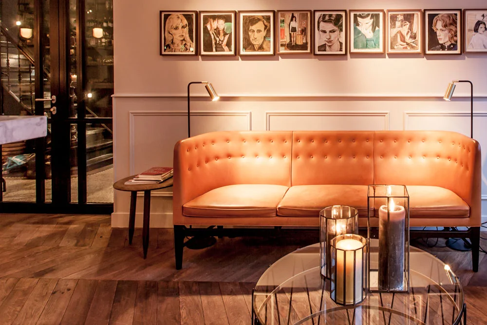
That Arne Jacobsen Mayor sofa by & Tradition in the carameliest of caramel leathers is just beyond.
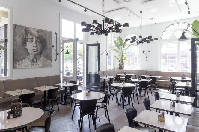
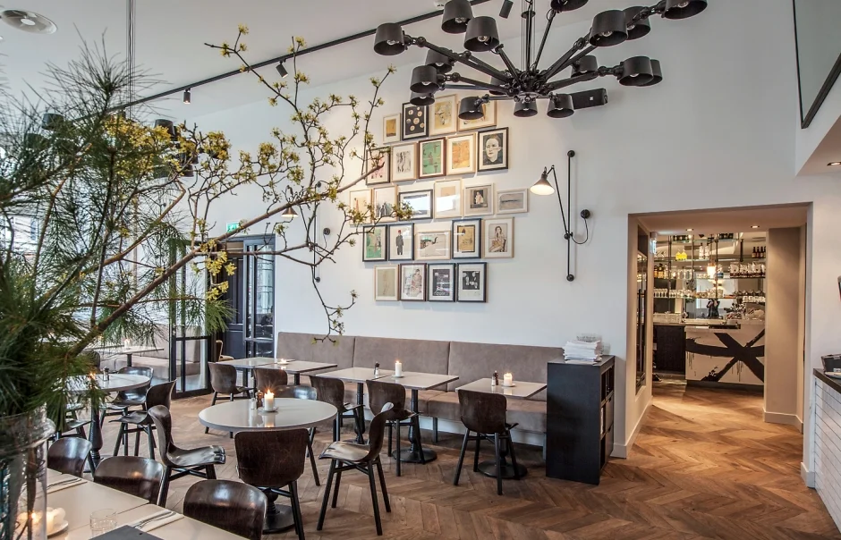
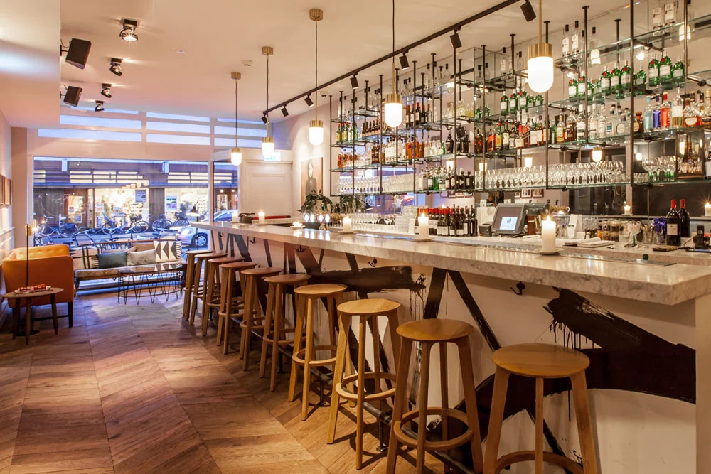
Even though the hotel is booked, I may be able to hit up the resto or bar in Oct. so I've added them to my travel list. Love this bright, airy voluminous space and the Lamp Gras wall sconces have been a long-time design crush of mine.
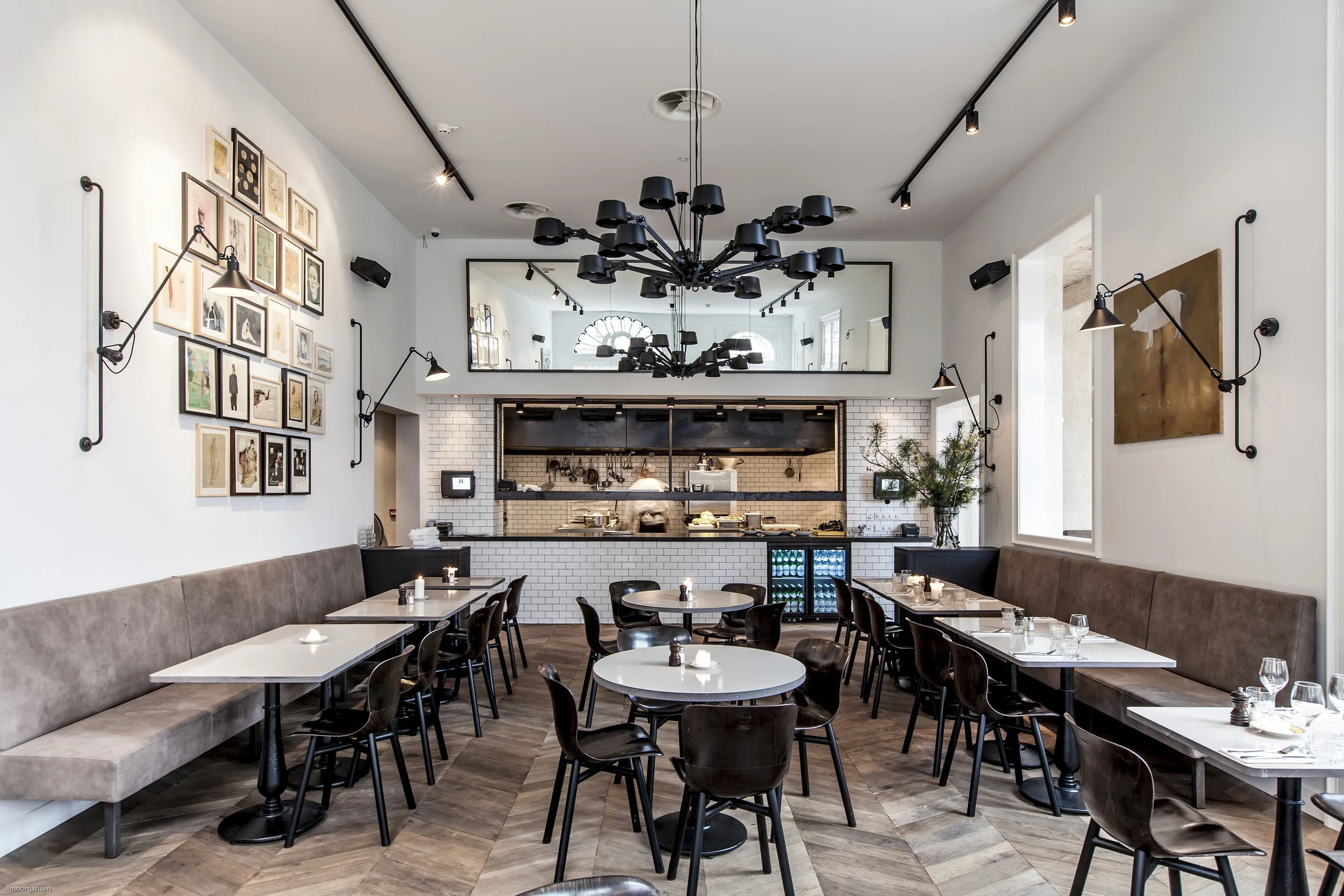
More of the simple excellence of the resto — that floor!
And this view of the adjoining space has me needing to know more about that wall treatment and those minimalist black sconces.
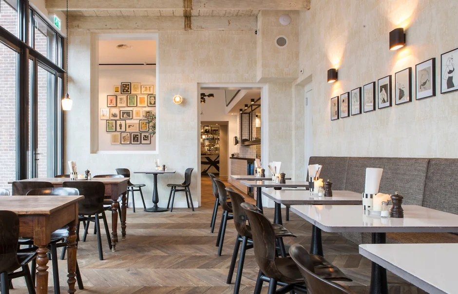
Love how this shot is framed with the wild greens in the foreground and the long view into the bar on the right.
That paint situation on the front of the bar looks interesting in a Franz Kline sort of way. And there's that leather sofa down on the left.
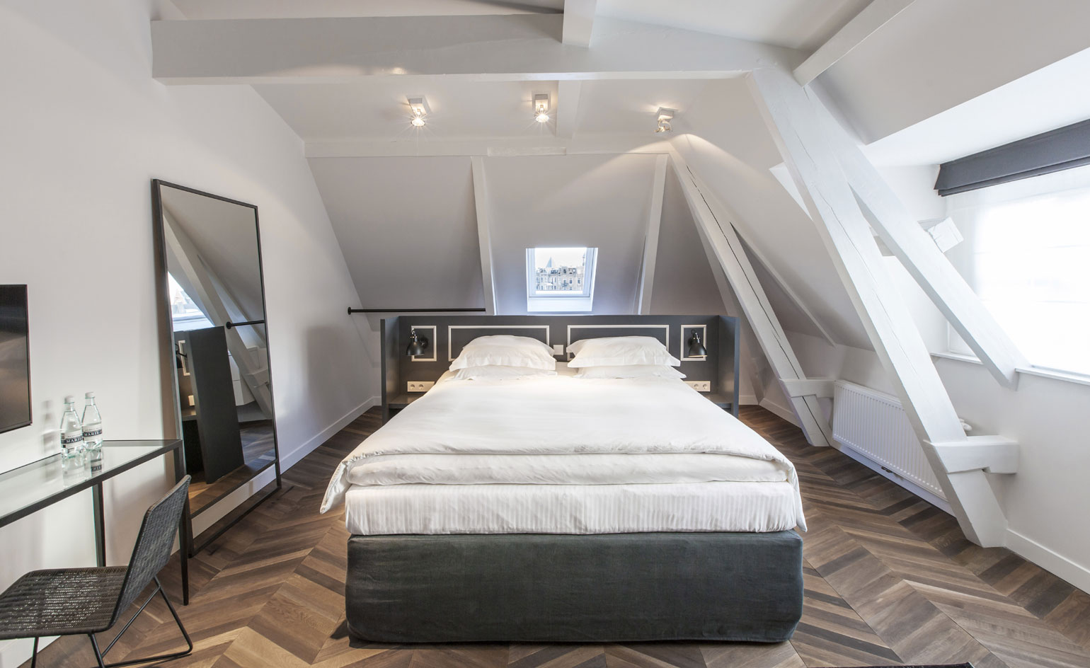
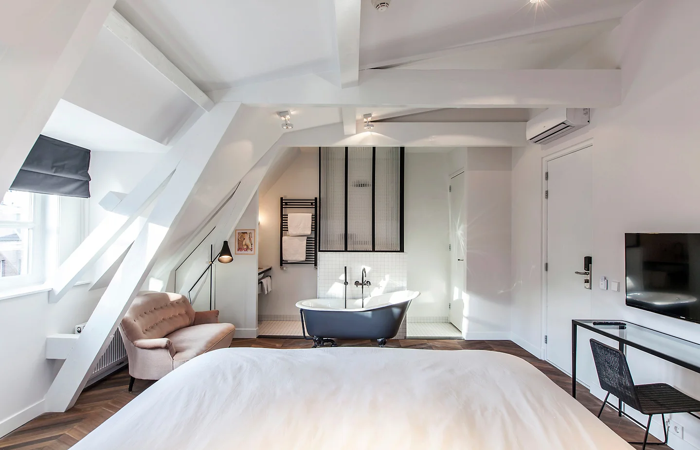
And here we are in a guest room. Beams and ceilings are all painted white to amplify the light, while the floor as the undisputed star. Beds simply dressed suits me fine! I did a little digging on those mattresses and they are by Coco-Mat and feature a 4-layer design for maximum comfort. First layer is the structure, designed to support your body weight, next is the mattress itself, which is an all-natural blend of coconut fibre and rubber, next comes the top mattress, which is either goose down (like a feather bed), natural rubber or pure virgin wool), followed by a protective topper. The whole deal sounds like heaven.
The mix here is the epitome of the hotel's design aesthetic, old-meets-new-with-a-good-dose-of-black.
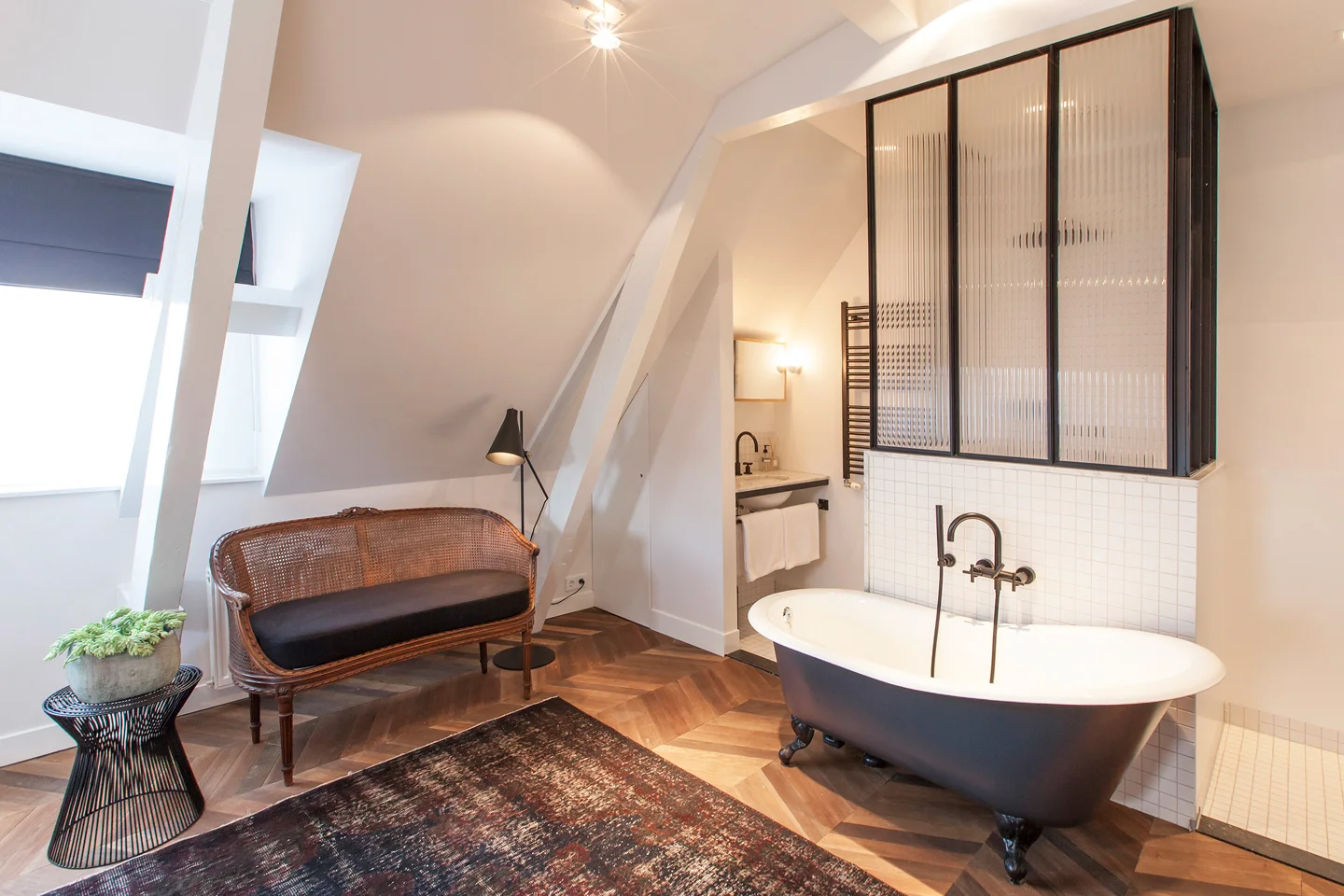
Not sure if this is the same room as the one above and they just switched out the settee, or if it's a different room. Prefer the velvet settee. More comfy.
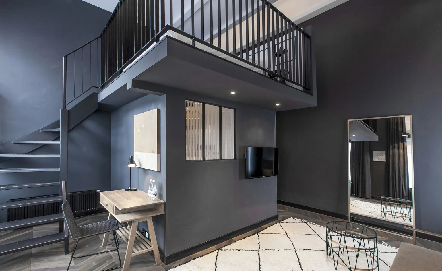
This loft design is interesting. The bed is up top and the bathroom is tucked down below. It's a very efficient use of space and delineates a desk nook around the corner from the TV zone. Excellent paint colour choice.
MEET THE DESIGNER: MARIUS HAVERKAMP
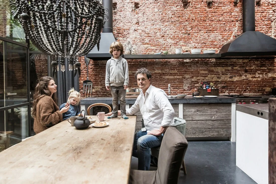
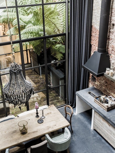
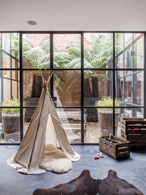
Here's Marius and his wife Emily Gray and their adorable offspring in their own jaw-dropping Amsterdam loft. Safe to say Marius is a master of the rough luxe look. Take a peek:

