Serene Spanish Style Home by DISC Interiors
I've been watching DISC Interiors for a number of years now. I can't remember exactly how they first got on my radar — likely in a photo research rabbit hole from back in my House & Home days. Anyhoo, just love their work. Disc Interiors is the LA-based design firm of Krista Schrock and David John Dick. My powers of deduction tell me the firm name is a mashup of the first two letters of each of their last names. I'm smart that way. But they are the smartest of smart. Here's a tour of a 1920's Spanish home the duo designed. It looks so serene and earthy and comfortable. To me this interior — and almost everything DISC does — epitomizes everything that's right with California contemporary style.
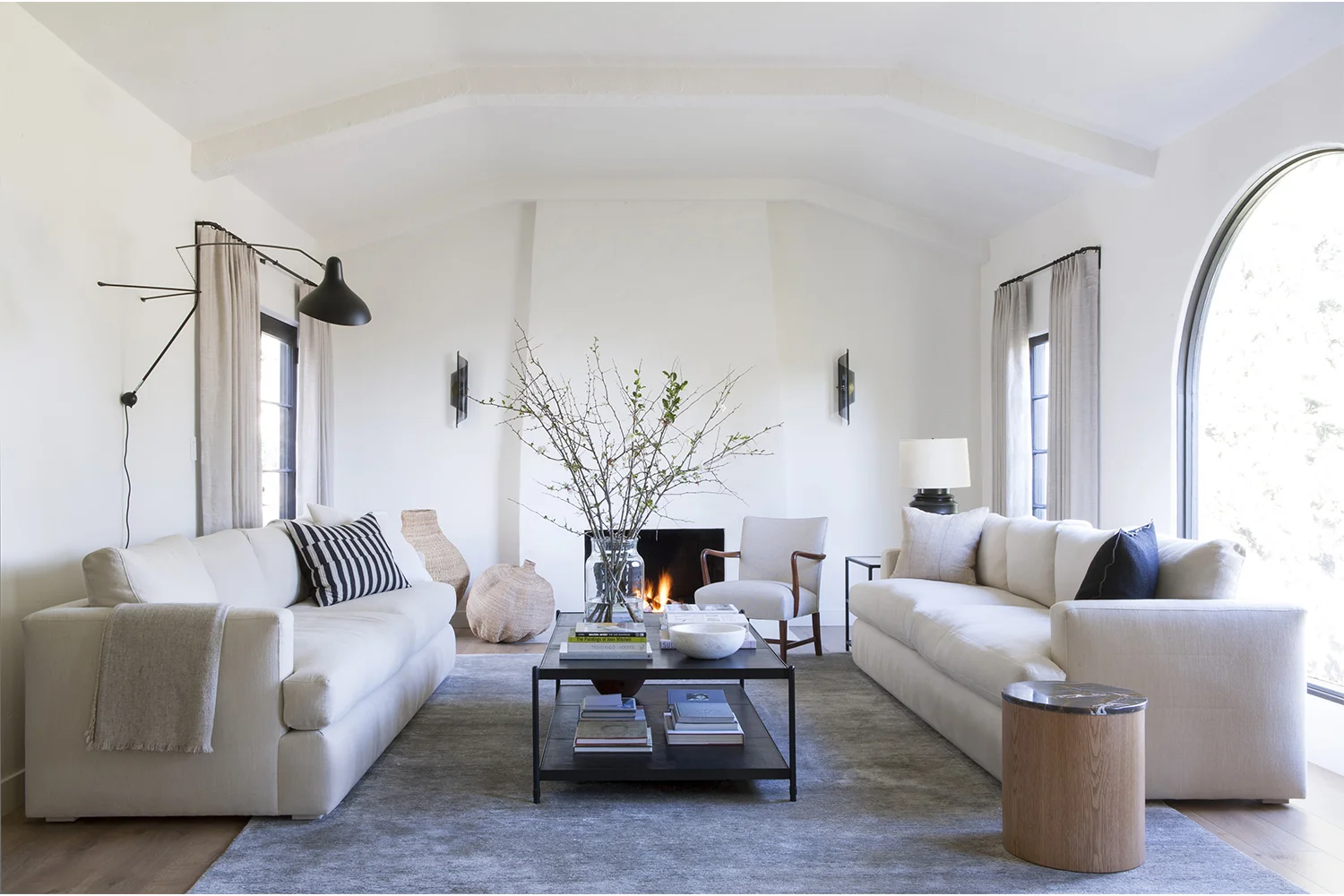
This wide shot of the living room is a perfect marriage of a great interior with equally great styling and photography. It's art. By the way, all photos are by D. Gilbert. The DISC firm philosophy states that the two have "An appreciation of imperfect beauty." No wonder I love their work so much. Wabi Sabi kindred spirits.
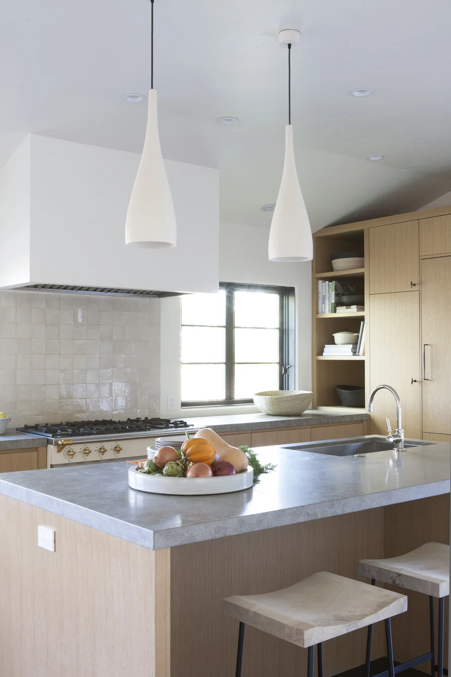
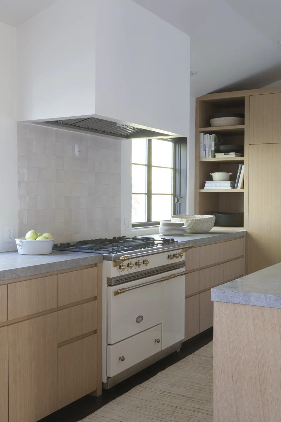
The kitchen is so minimal yet so packed full of details to note. The disappearing range hood is a trend gesture that helps reach the end goal of visual quietude. The mix of finishes is a delight — very understated use of creamy handmade tiles alongside concrete counters and blonde wood cabinets result in a gentle harmony of tones. Nothing too stark, no high shine or high contrast.
Even the range plays along with not even so much as a blackened glass oven door to interrupt the symphony of creaminess.
"We favor rooms that reveal themselves quietly over time and offer ease to our clients — homes of calibrated simplicity that balance the push and pull of modern life." — Krista Schrock and David John Dick
This room compels me to reject colour and embrace only texture from this day forward.
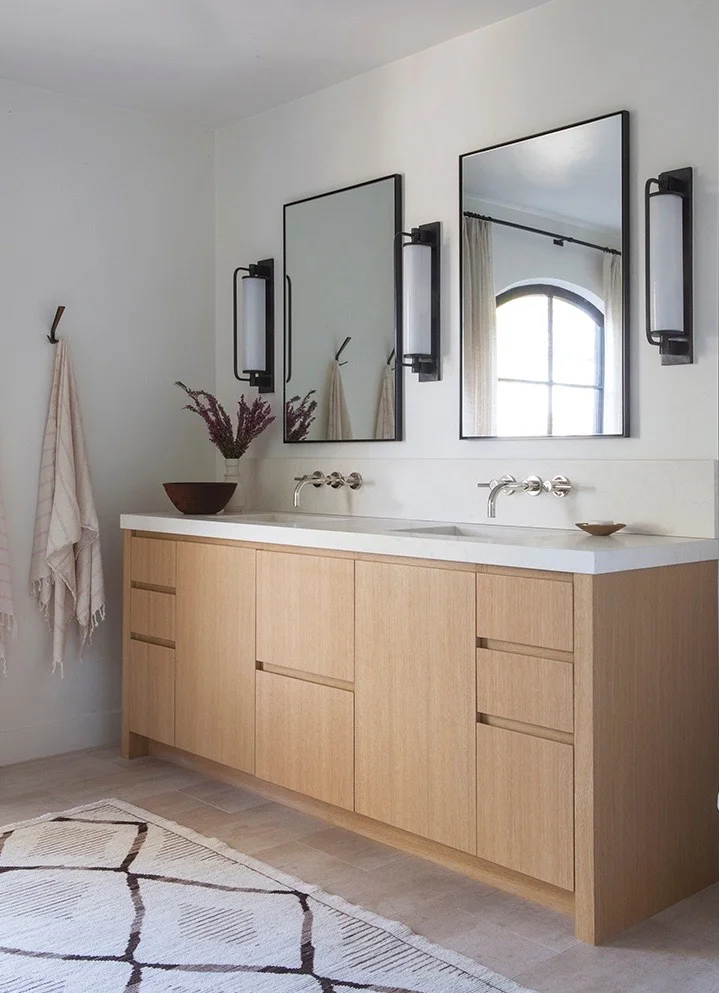
Please note: wall-mount faucets, tiny bits of black, towels on hooks, no hardware on the vanity, no crazy tile, stunner of a carpet. All of these things make me love this.
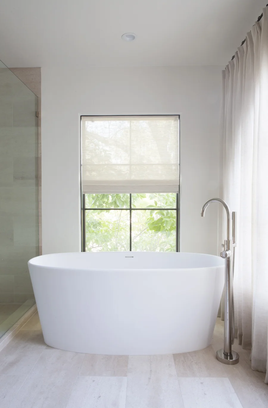
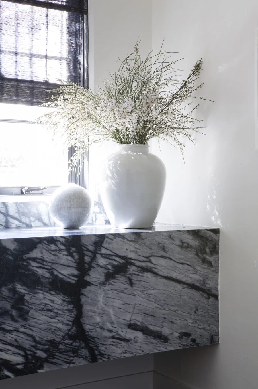
If this looks familiar, you may be recalling that I included this dreamy bath in my post on Top 10 Bathrooms for 2017. It's nice to see it here again in the context of the house it belongs to. This room makes me feel vindicated in my recent choice of plain oatmeal linen for a Roman blind and off-white unlined linen for drapes in two recent client projects (after reviewing a gajillion print fabrics). My inner voice kept saying "keep it simple". My stylist heart really wants to see some very interesting basket or tribal stool here. Or a tall vase with just some leafy branches in the back corner. But I'll get over that.
:::sharp intake of breath:::
"We source materials that transform with light and organic textures that patina gently like metals that burnish with touch, leathers that soften, and floorboards that reveal more of a home's soul with every year." —Krista Schrock and David John Dick
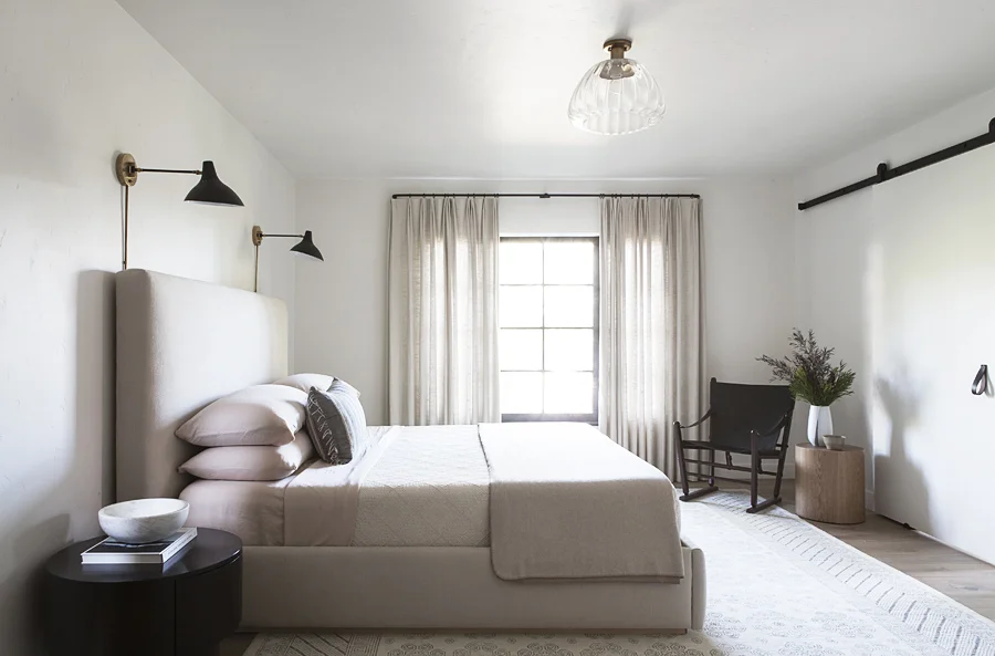
In case you hadn't noticed, there is a very strong movement afoot to unseat the fluffy duvet from its throne of bed making domination. Take a peek here: Simple, non-fluffy, only ONE extra pillow (notably a large rectangle). Also, please do not miss the pink sheets and pillowcases. And you just know that room smells incredible. Just one piece of art would be nice though. Arguably that chair is the sculpture in the room.
visit DISC Interiors.
all photos: D. Gilbert.


