Recent Styling Work: HomeSense Canada 150
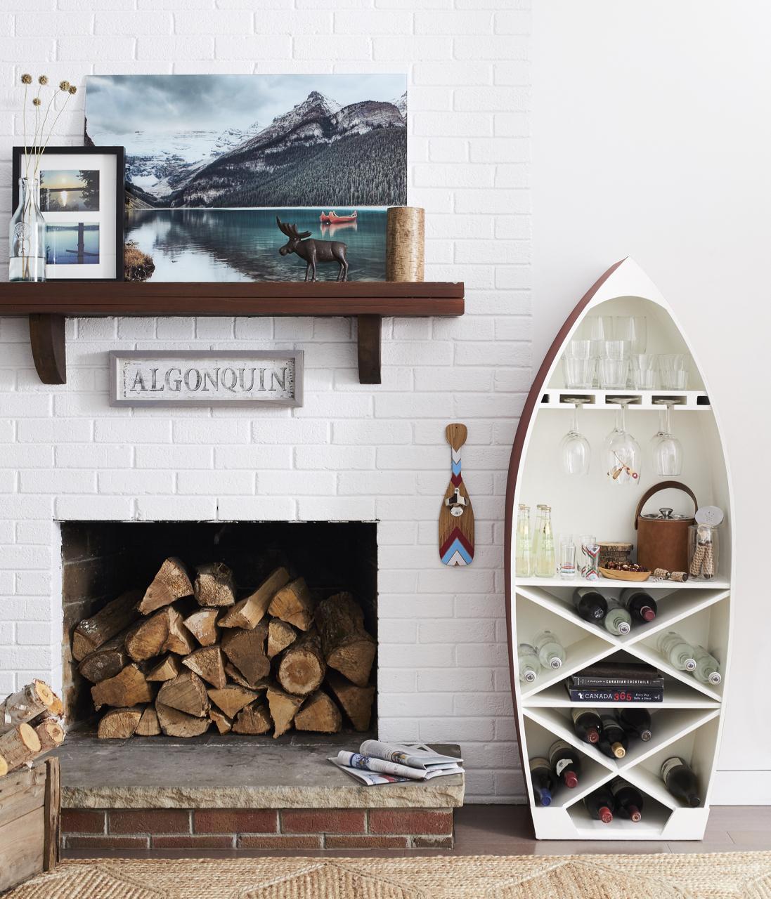
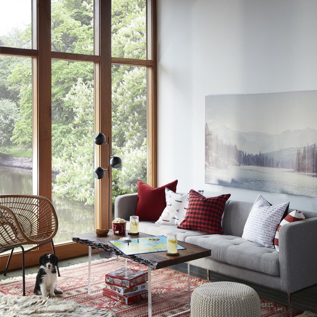
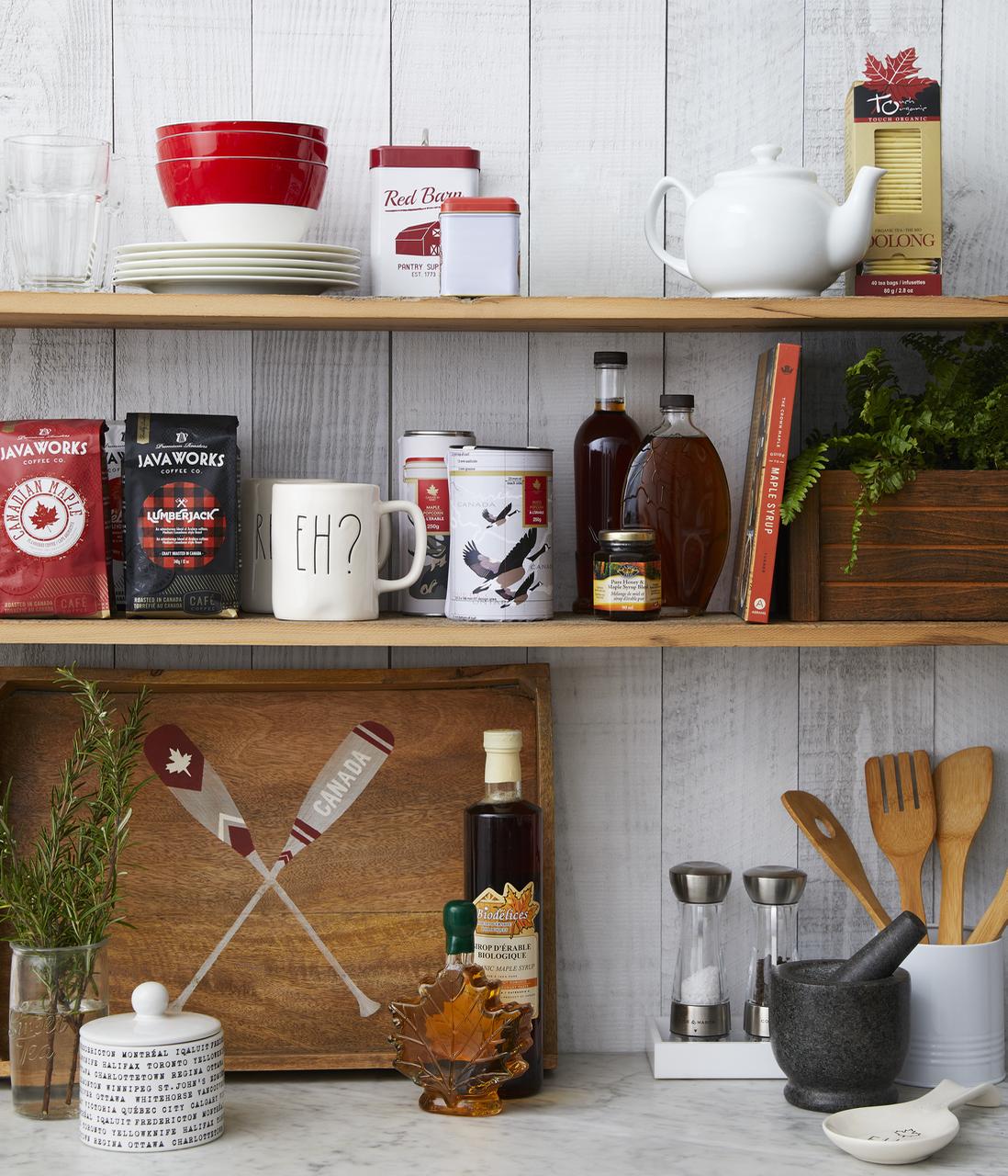
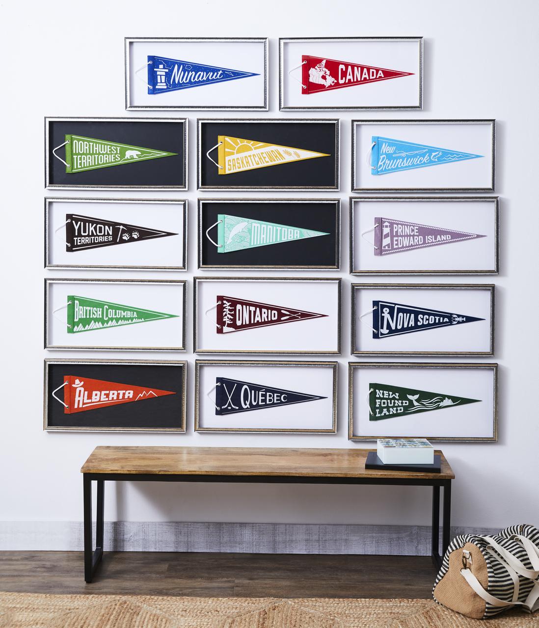
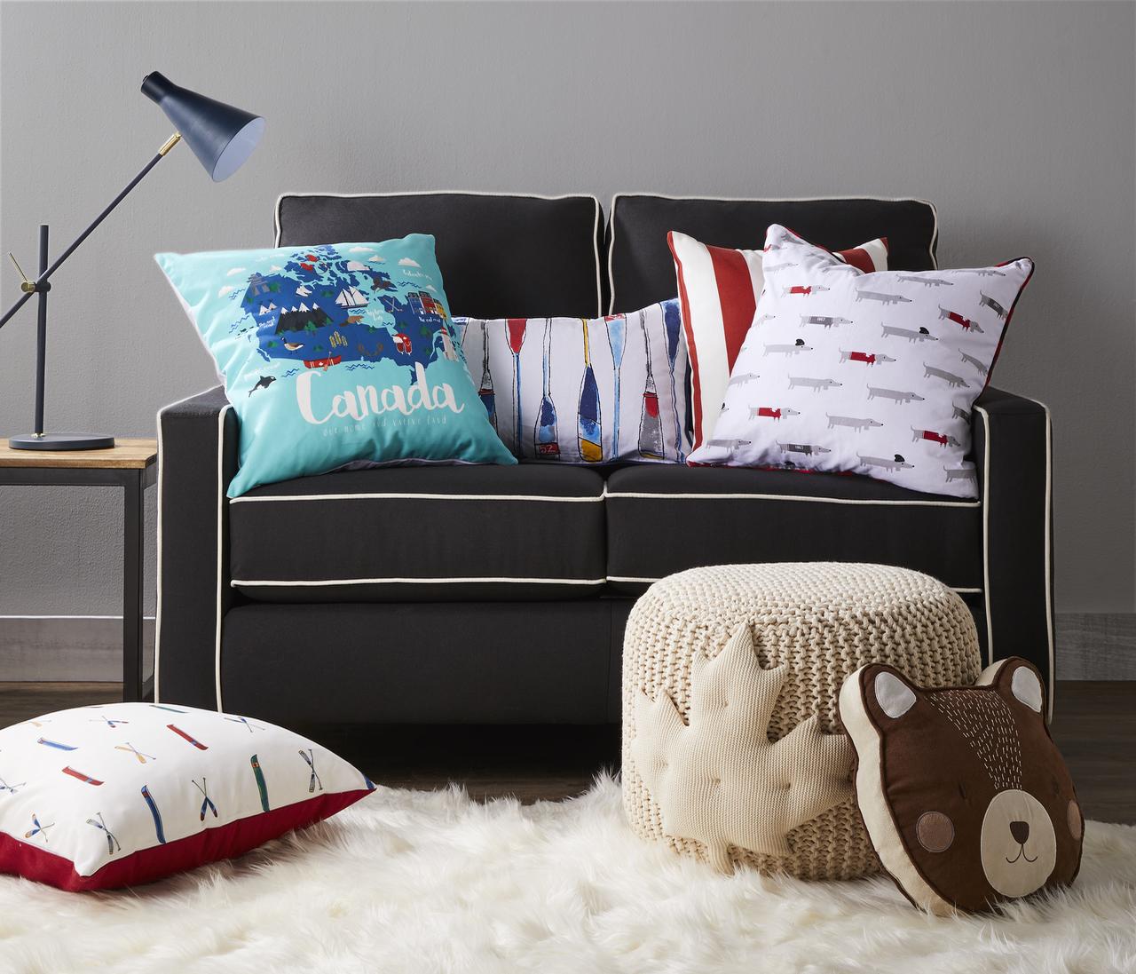
Greetings, I just received an e-blast from the folks at HomeSense (aka TJX) that was also a blast from the past. Well, just the recent past. A few weeks back I worked with the PR team there — Tamara Robbins-Griffith, Shannon Johnson and Emily Lamb — to produce and style a 2-day shoot. Images from the shoot formed the basis for the email and will be popping up on social media too. It's fun to see your work come back at you like that.
The Brief:
The assignment started out something like this: "We found a very cool contemporary space to shoot in and we'd like to you pull together some ideas for how to best showcase our products focussed on marking the Canada 150 celebrations." What followed was a series of emails with lots of scouting shots for me to mull over. First came the batch of product scouting shots from the head office location. The products were grouped by category. There was a ton of red and white and black and grey and maple leaves. I kept zooming in to try to see everything. Next came the location scouts. The house is a KILLER contemporary situated on an extraordinary ravine lot. We'd have one day to shoot at the house and another day in studio.
My Concept:
Inspired by the occasion, the location and the product, I built a shot list around the concept of a modern cottage weekend. I did up a few rough pencil sketches to show each shot then I created a shoot concept document. In the biz this is The Deck. Most people use PowerPoint for these but I'm all about Keynote. For the Deck I pulled in the sketch, the location scouting shot for each image, and scouting shots of products I planned to use to prop the set. Once complete I sent the Deck back to my clients for their approval. They called back, we killed a shot from my initial proposal, we decided to come in tighter on another one and we added a shot. Then I was off to the races to scout and prep for the shoot, which was a few days after final approval.
The Selects:
Selects is another insider term — it just means, these are my faves from the shoot.
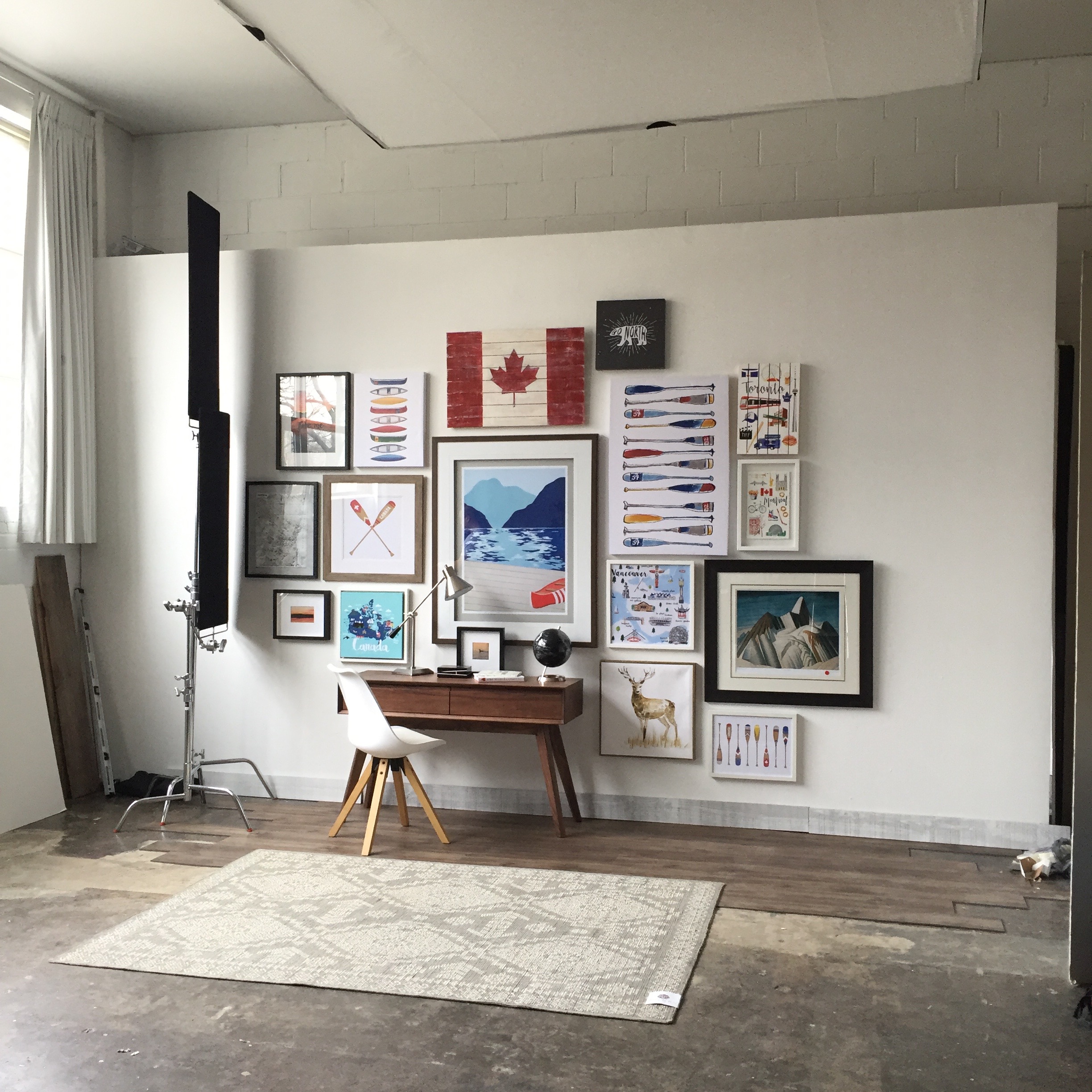
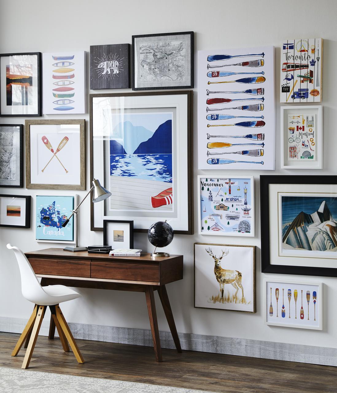
Top 3 Tips to Getting a Perfectly Imperfect Salon Wall
1. Start Big
Hang the largest or most important piece so that it has pride of place and prime visibility. Do not measure. Do not hesitate. Figure out where it will be in relation to nearby furniture, then get the hanging hardware of choice in the wall and get that thing up. In this arrangement I started with the Lake Louise art with the red and white canoe.
2. Keep it Cozy
One of the biggest salon wall faux pas I see out there is when pieces are hung with giant spaces between them that you could drive a truck through. No. No. No, people. Keep. It. Cozy. Keep. It. Consistent. Let three inches be your guide.
3. Strive for Balance
Use your eyeballs and trust them. Balance colours, sizes, frame styles and subject matter.
BONUS TIP: Keep editing and adding to the display as your collection grows and changes.
Happy Canada 150 my excellent friends.
photos (except for top one): Michael Graydon.

